MATCHI
Matchi is a premium Japanese Matcha House, serving the finest matcha sourced from Japan.
The name combines ‘Matcha’ with ‘Machi’, the Japanese word for neighbourhood, reflecting the idea of creating a neighbourhood matcha spot built around everyday rituals.
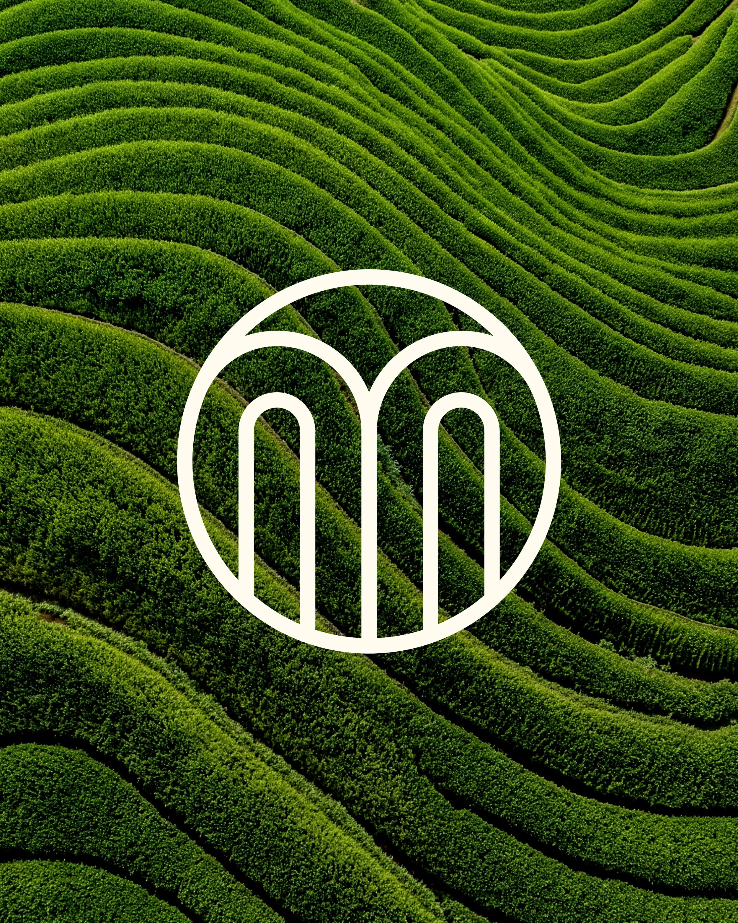
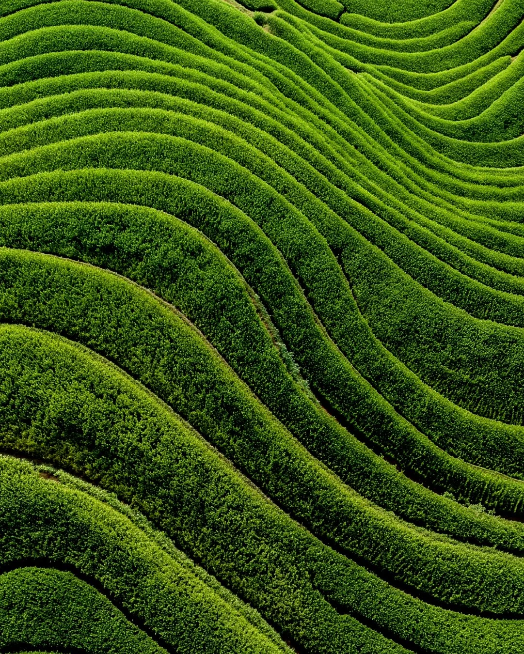
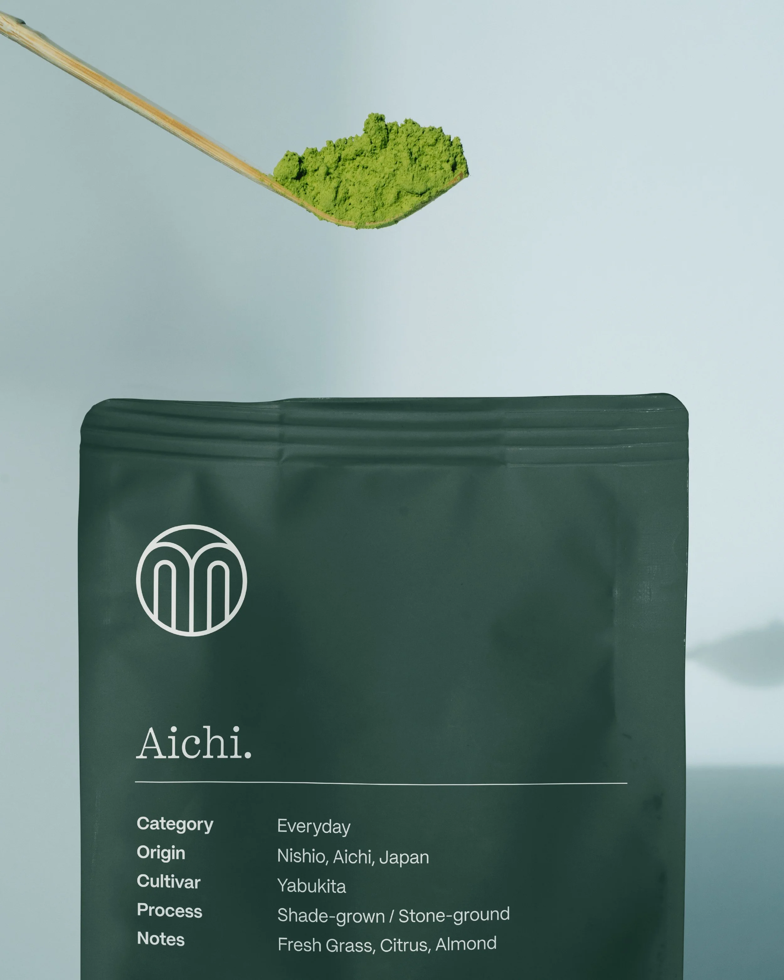
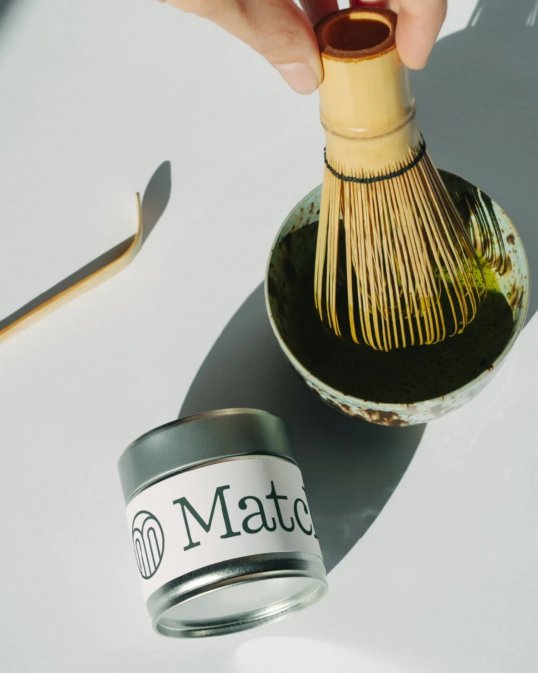
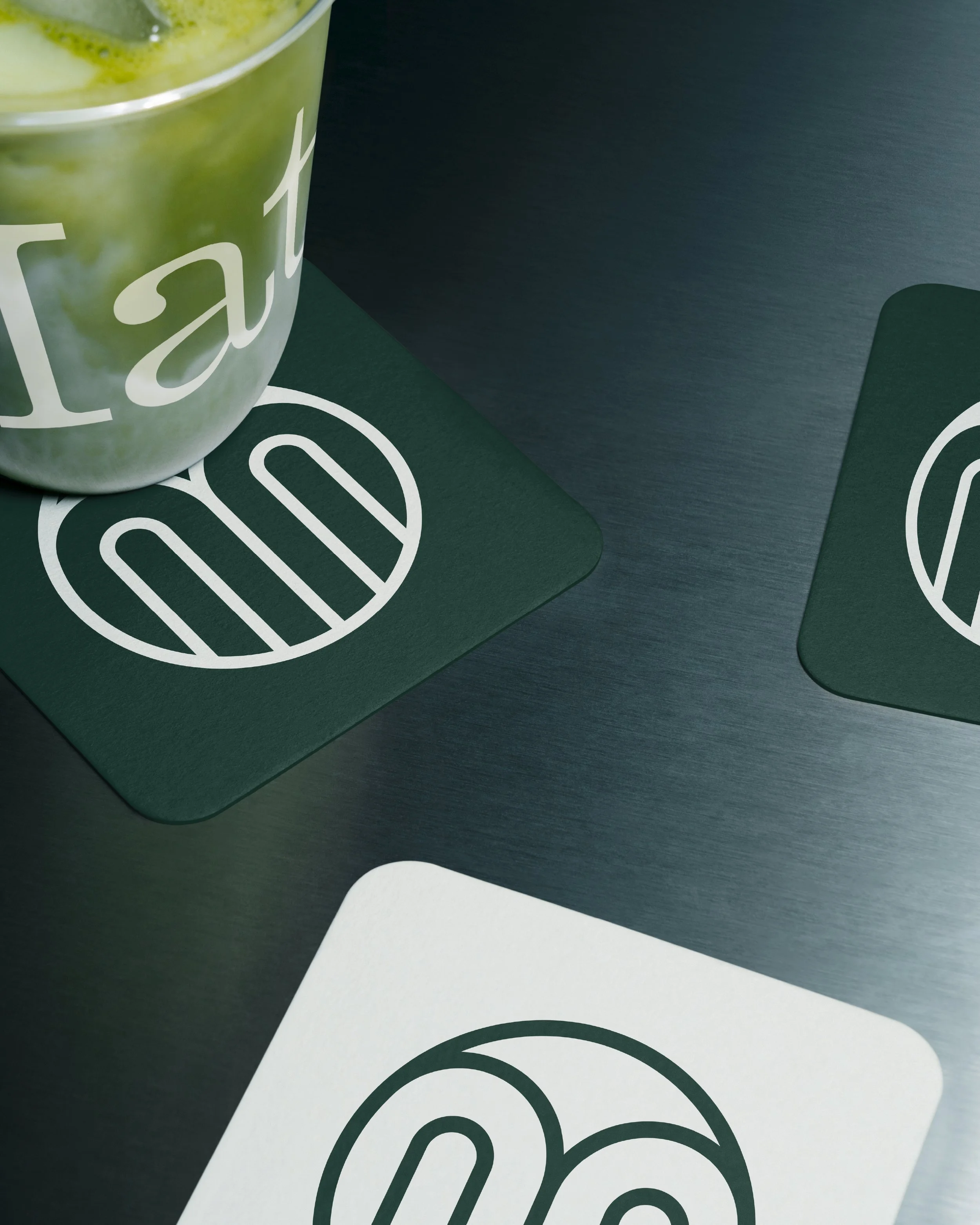
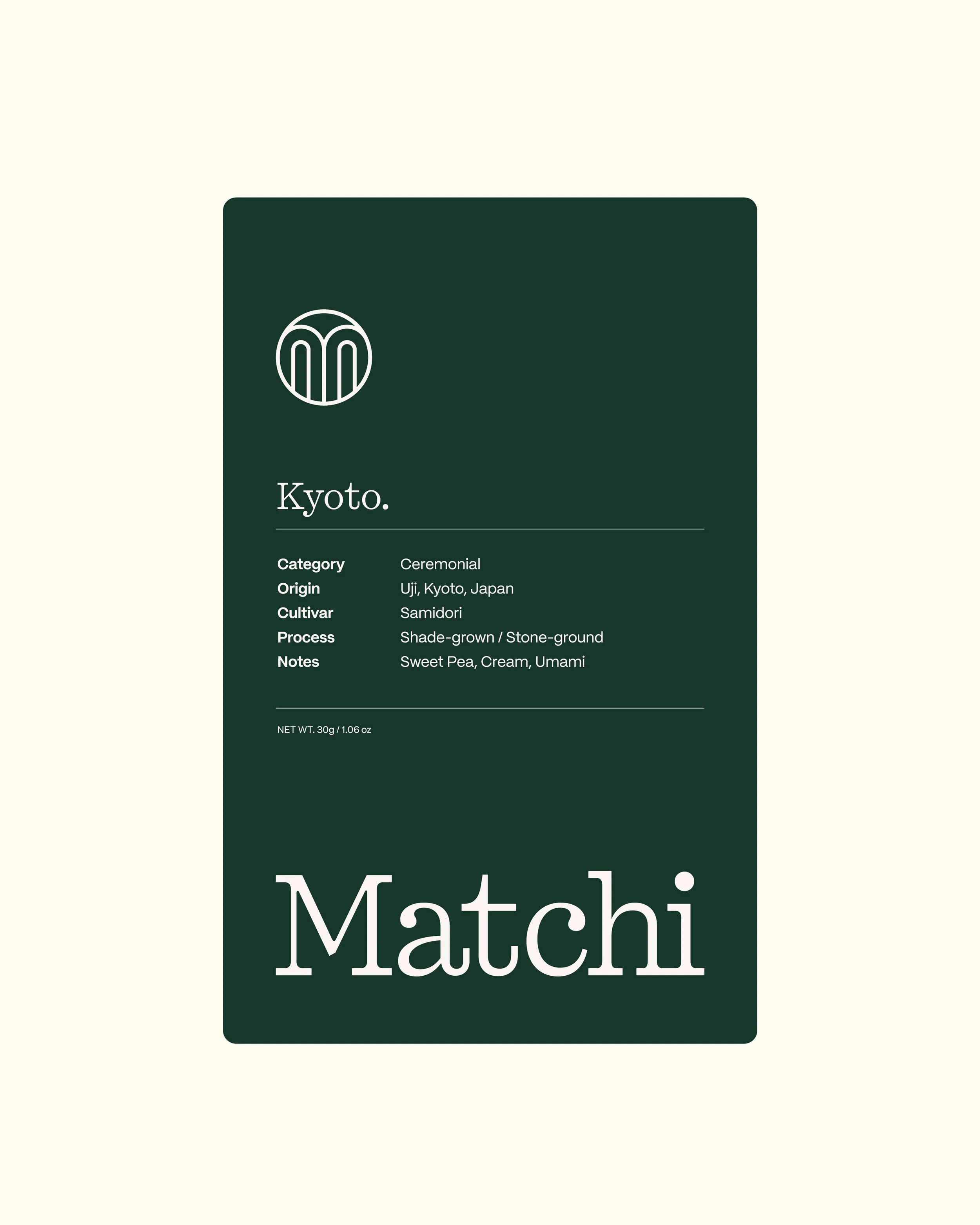
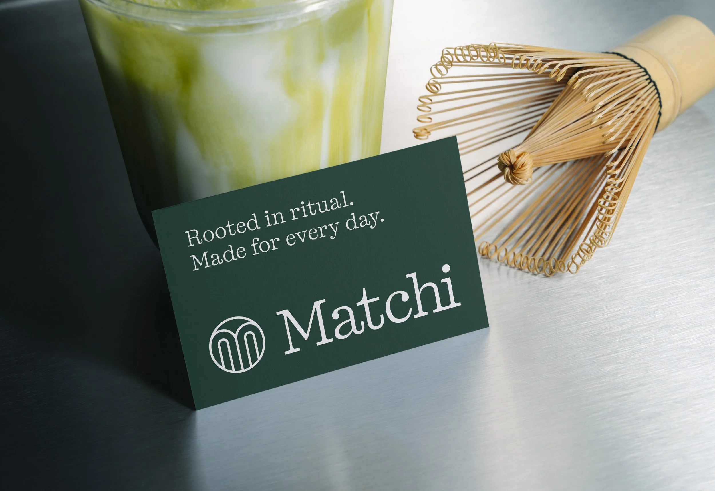
The project involved developing the name and creating a complete brand identity for Matchi, with the aim of creating a distinctive visual style that feels premium, considered and instantly recognisable. The logo mark takes inspiration from the rounded shapes and flowing lines of Japanese matcha fields, creating a simple yet distinctive symbol that connects the identity to its origins.
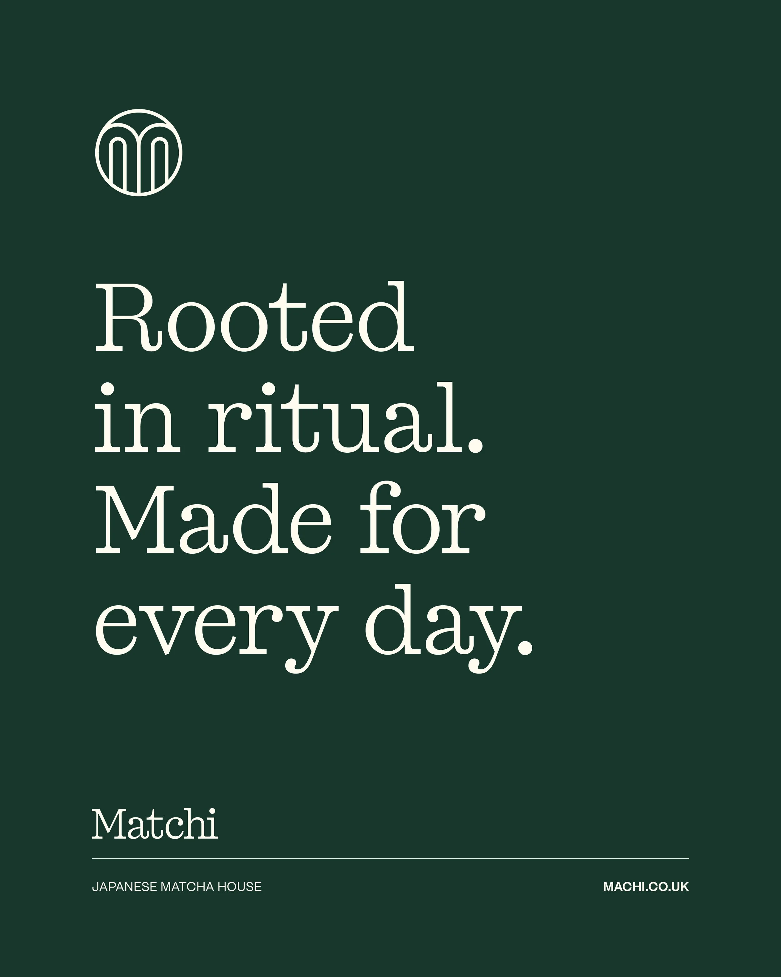
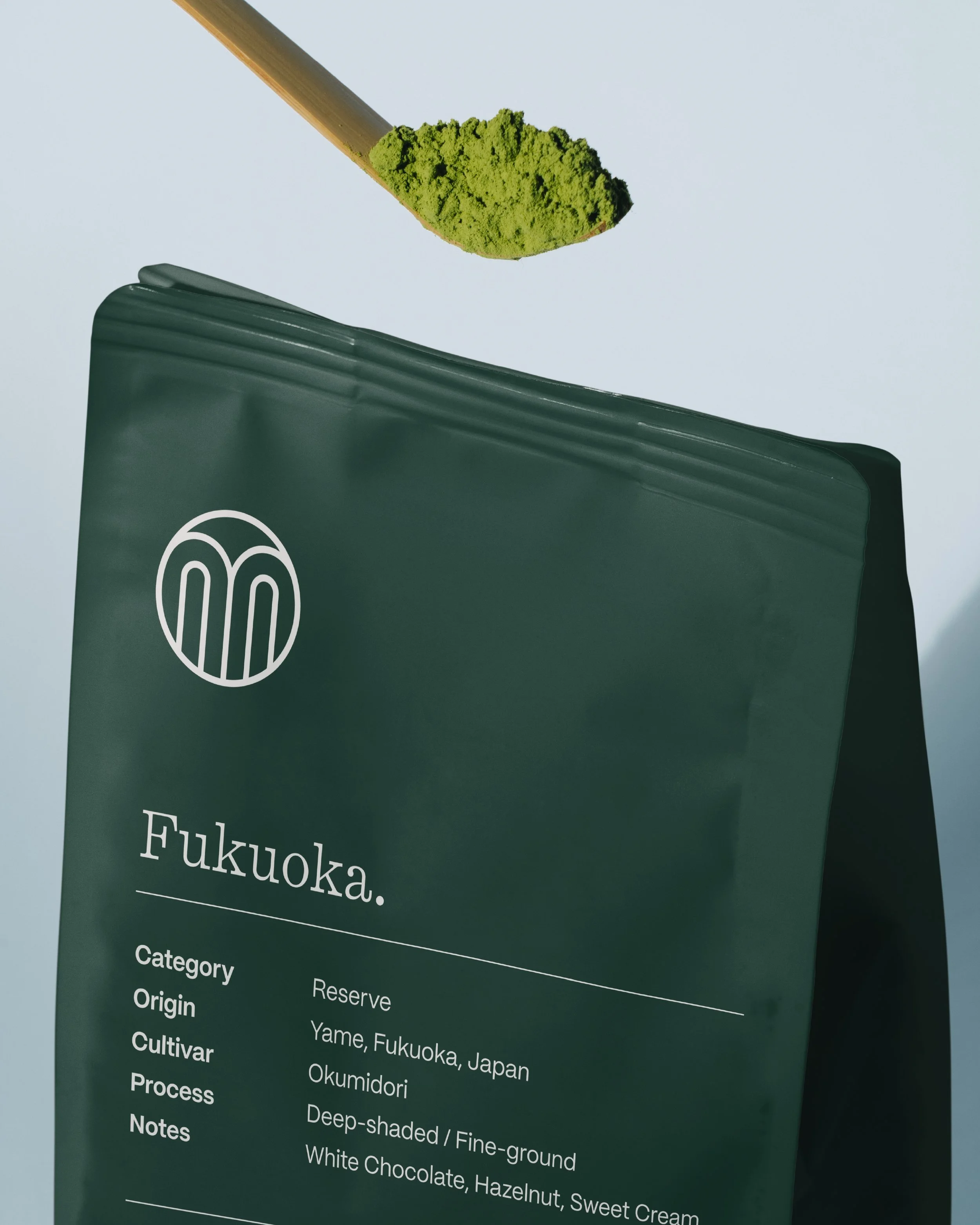
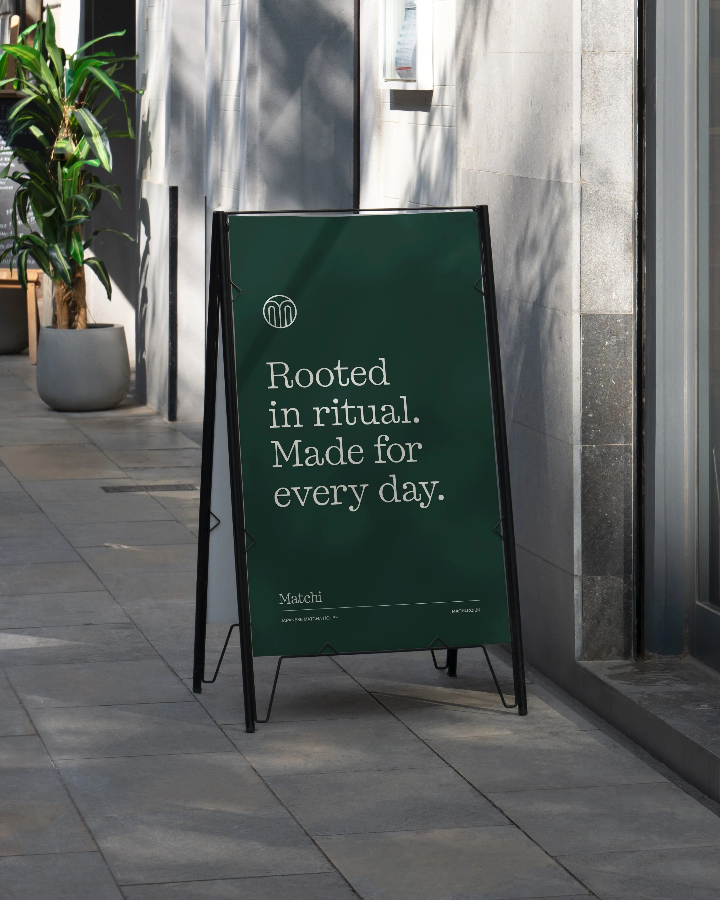
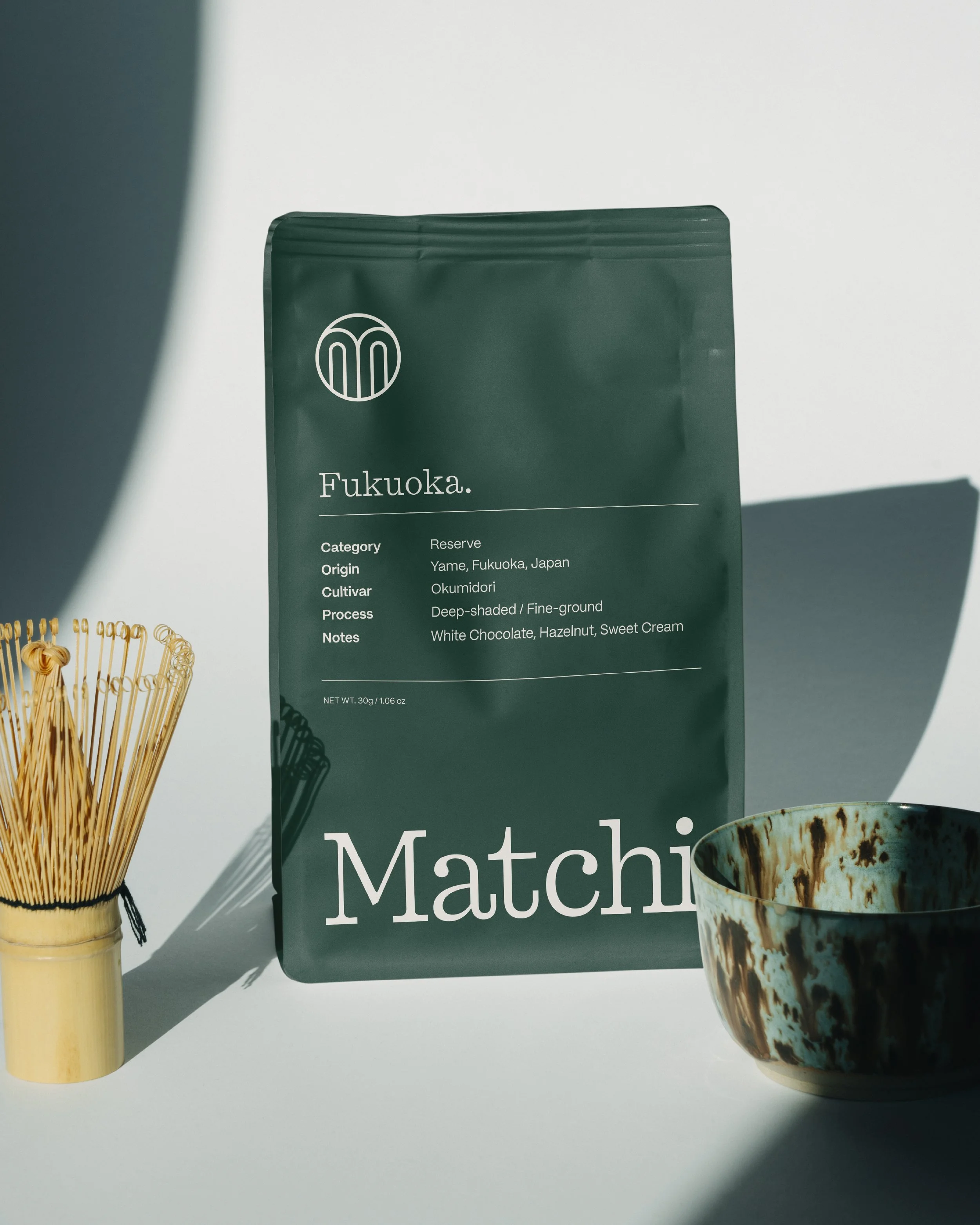
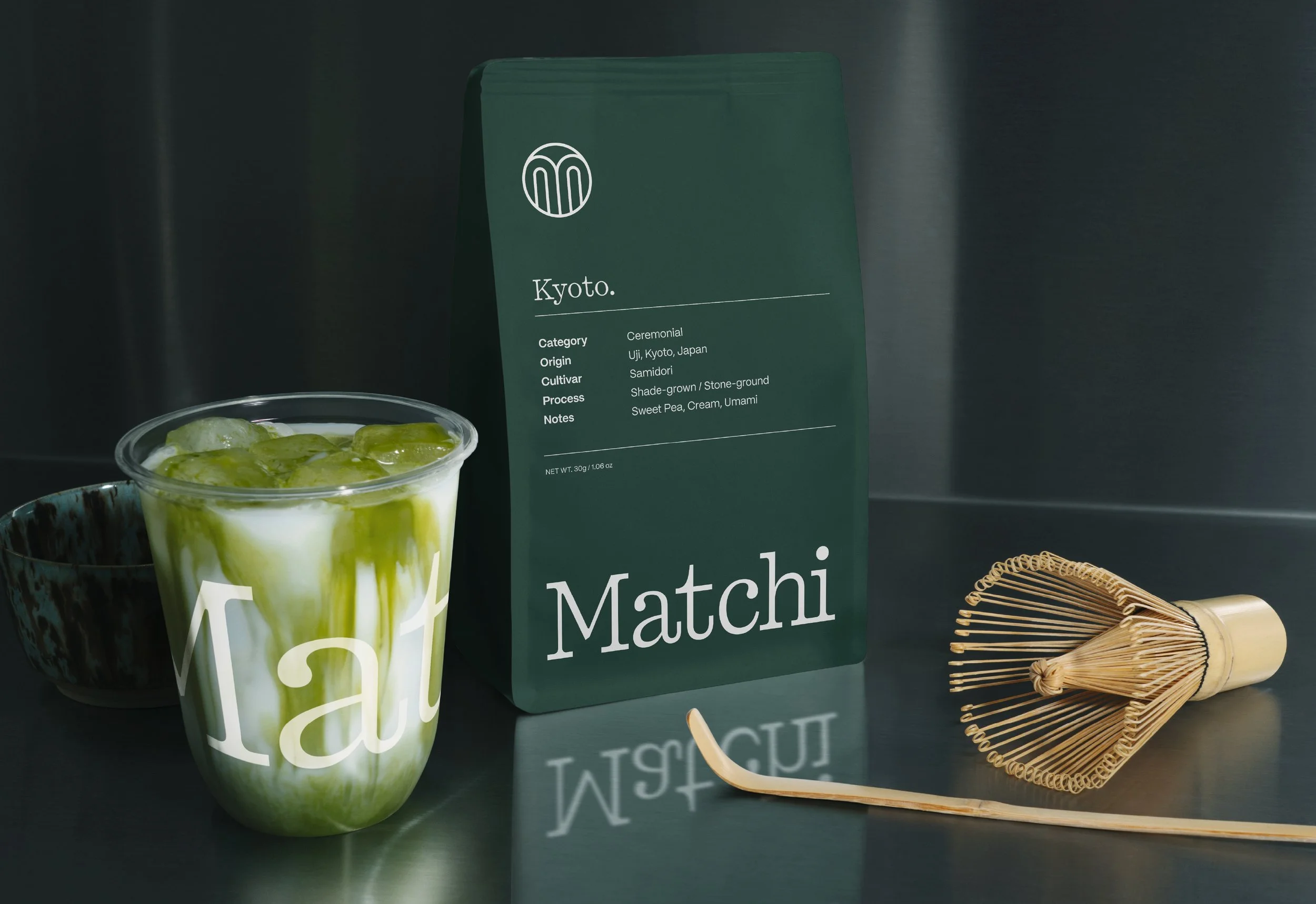
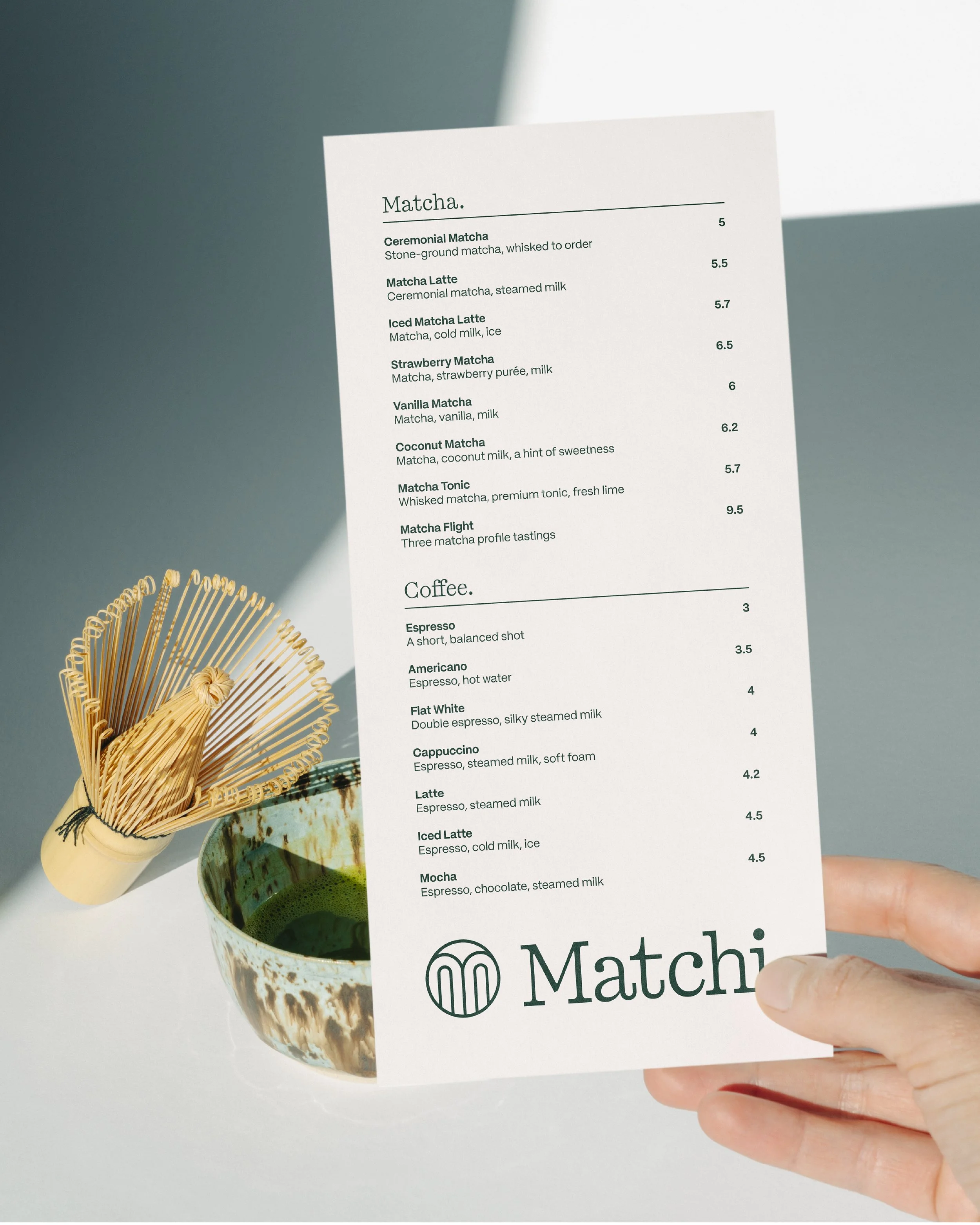
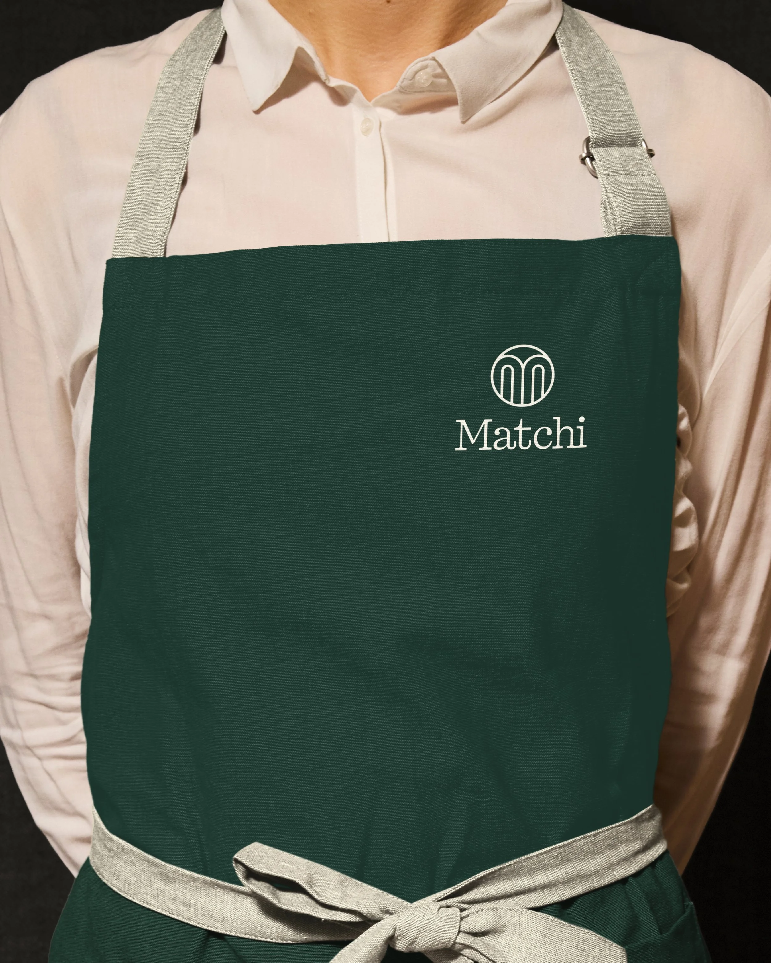
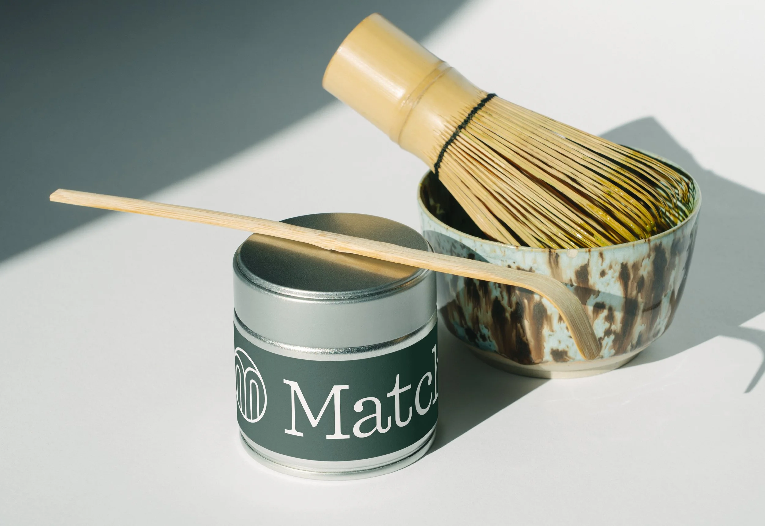
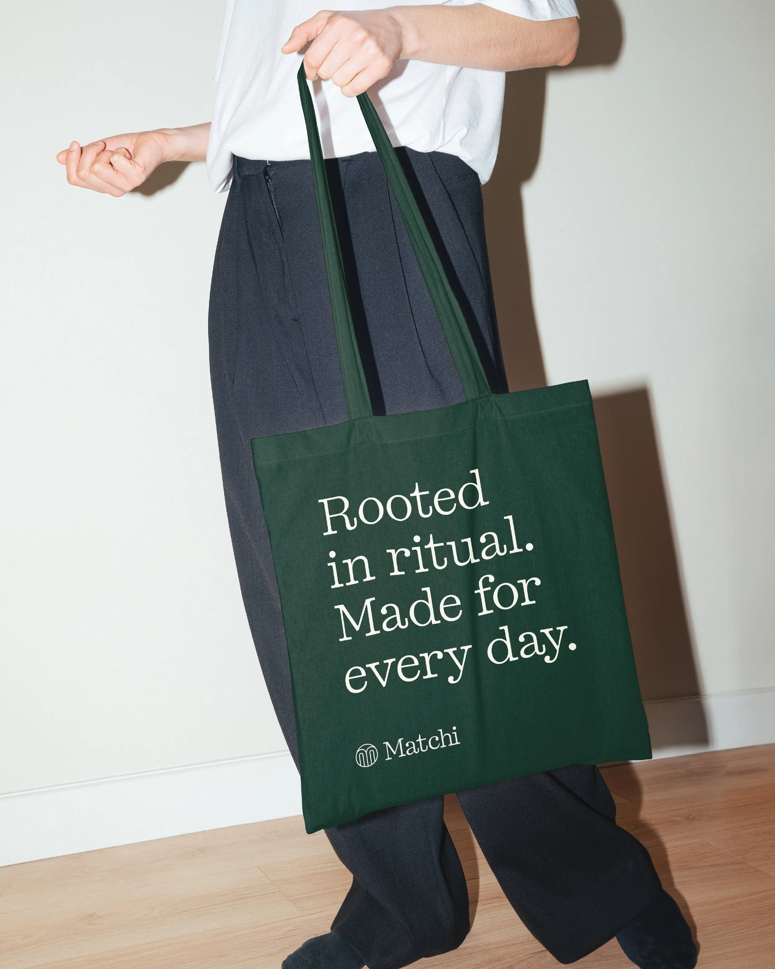
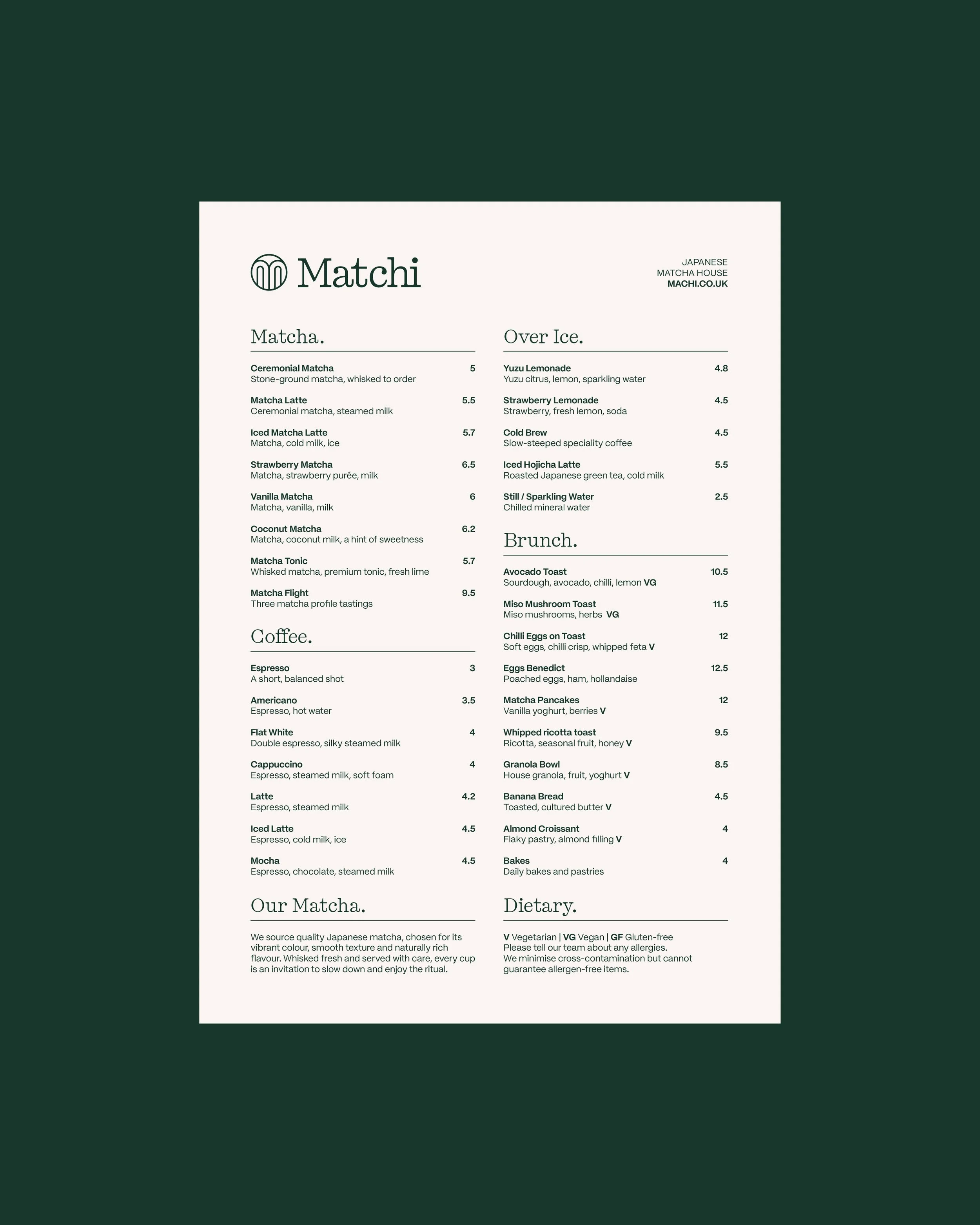
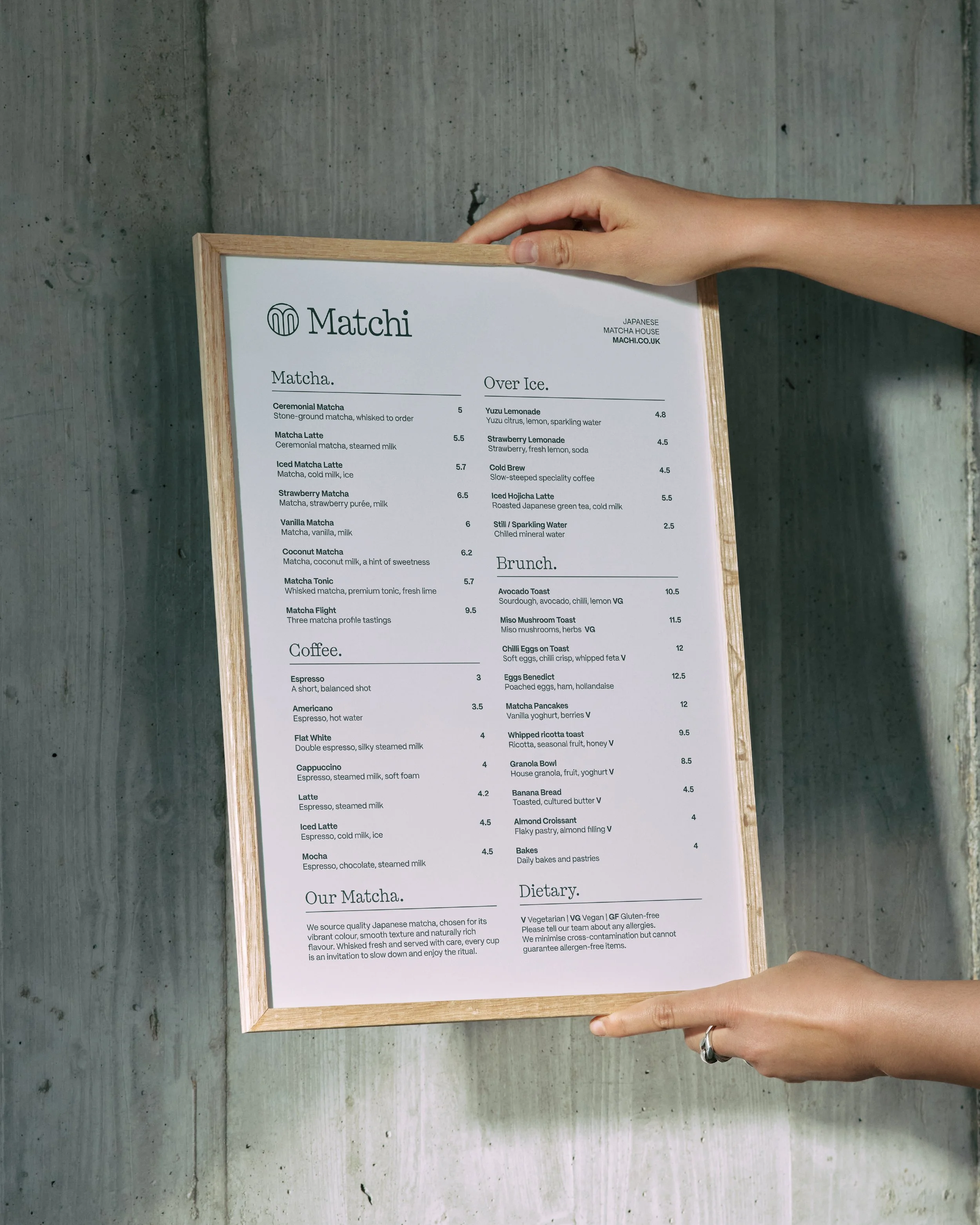
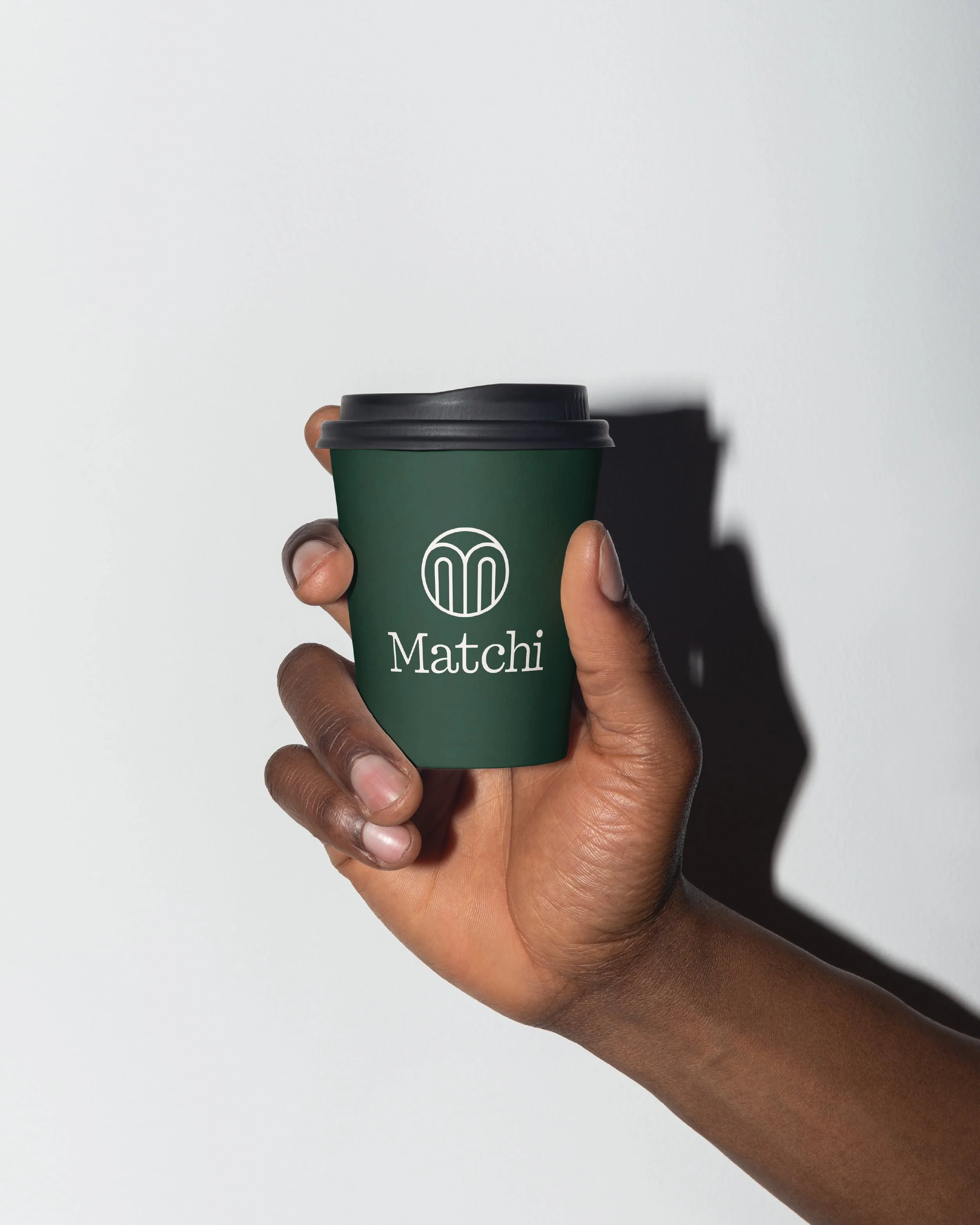
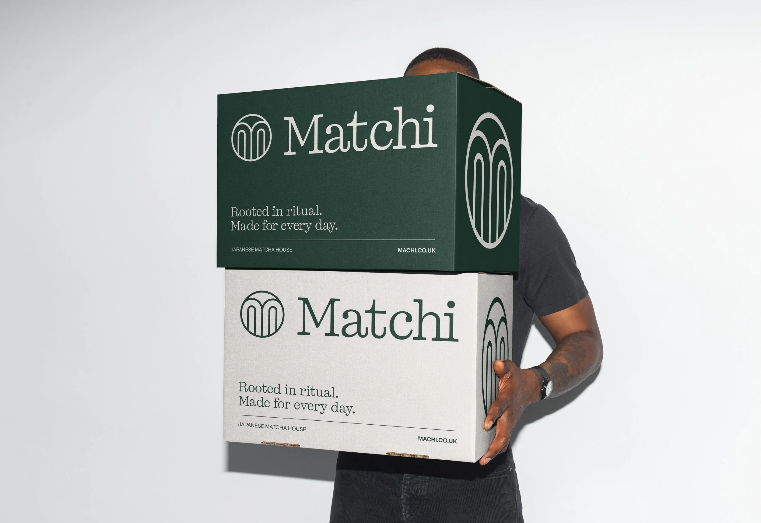
A rich forest green and warm off-white colour palette form the foundation of the brand, complemented by elegant typography and considered layouts. The visual identity was applied across a range of touchpoints, including menus, matcha packaging, takeaway cups, signage and branded merchandise.
Every element was designed to work together to create a cohesive brand experience, from the first visit to the daily matcha ritual. The result is a refined and recognisable identity that brings a fresh perspective to Japanese matcha culture.
Services
Brand Identity, Menu Design, Packaging, Print, Signage, Merchandise